Understanding Percentiles
Percentiles are a statistics concept, but you often see them mentioned in software engineering. Like this, this, and this. If you're wondering what they're all about and why we should care, this post is for you.
The statistics part
(If you're already familiar with the concept of percentiles, you can skip this part. Also, I only did statistics up to secondary school, so please correct me if I'm wrong.😀)
Let's say we have a distribution of recorded values, say test scores or heights or weights. Percentiles give us a way to split this distribution into 100 equal units based on not just the actual values (the scores), but how often they appear (their frequencies). I'll skip the details of this calculation, but here's what it works out to: the nth percentile of a set of scores is a value that has n% of scores falling below it.
Let's see an example: 12 students took a test, and their scores were: 12, 25, 25, 40, 49, 63, 65, 67, 67, 70, 76, 79. The 50th percentile is 64, because 50% (half) of the scores are below 64. You can see that there are exactly 6 points to the left of 64, and 6 to the right.

In the same way:
- the 35th percentile is 44.95, because it has 35% of points (35% of 12 points = 0.35 * 12 ≈ 4 points) below it.
- the 90th percentile is 78.1, because 90% of points (0.9 * 12 ≈ 11 points) are below it.

A common expression used with percentiles is "I'm in the nth percentile". Standardized tests like the SAT often tell you what percentile you're in when they send you your results. If you're said to be in a certain percentile, that means that that's the nearest percentile point below your score. More formally, it means that that your score is greater than n per cent of scores.
In our sample, the 76th percentile is 69.64, while the 77th percentile is 70.6. This means that if you scored 70 (or 69.7, or 70.1), you're "in the 76th percentile".This means that you scored greater than 76% of the class, so, yay you.👏 So:
- being in the 76th percentile is good
- being in the 93rd percentile is awesome (you scored better than 93% of the class!)
- being in the 69th percentile is nice
- being in the 50th percentile is okay (you're in the top half of the class)
- being in the 10th percentile is pretty bad (90% of the class scored better than you).
Some fun facts:
- There's a short form for percentiles: p90 (or P90, or P₉₀) means "90th percentile", p75 means "75th percentile"...you get the drift.
- Just like percentiles, there are also other units of division. Quartiles (dividing the distribution into four) are also pretty popular.
- The median (mid-point of a distribution) is actually the same thing as p50.
- There's a 0th percentile. If your score is the lowest, then you effectively scored greater than 0% of people.🤷♀️
The software engineering part
Whenever people mention percentiles, there's often some implied context. If a student says, "I was in the 95th percentile", you know they're talking about test scores. In software, you'll hear statements like, "Our 50th percentile is 50 milliseconds, while our 90th percentile is 4 seconds". The implied context is most likely to be latency or response time, but it could also be any other metric, such as cache TTLs or time-to-interactive (the time it takes for a web page to be fully loaded). We'll focus on response time here, but the general idea applies across all metrics.
By "response time", I mean the time it takes for a service to handle a request and produce a response. If you have an app with a lot of users, you probably have some metrics setup that monitors the performance of your service. Now, how do you determine if your service is fast or slow?
First off, you'll probably have a rough threshold for concern, based on what your service does. Say all your service does is a simple database query. If it responds in 200ms, that's okay. If it takes more than 1s, that's concerning. If it takes 2s, you should check it out.
But what do you compare against that threshold? You can determine if 1 request is fast or slow, but what if 100,000 people are using the service per minute? How do you generally decide if there's a problem or not? This is where statistics comes in handy. Statistics gives us measures that help us describe a distribution without us having to look at each value in the distribution.
The most popular measure we could use is the mean (aka "average"). If you have four requests with response times of 100ms, 120ms, 96ms, and 102ms, you get a mean of (100 + 120 + 96 + 102)/4, which gives you 104.5ms. You do the same kind of calculation for your 100,000 requests per minute: find the average, and you have an idea of the overall performance of your service.
But the mean has a big weakness: it's skewed by outliers. Supposing we made two more requests, and they were quite slow: 2s and 2.4s. The mean is now (100 + 120 + 96 + 102 + 2000 + 2400)/6 = 803ms. But the mean is effectively lying. When we look at it, we'll think, "Oh wow, the response time is typically 803ms. That's not very fast, but it's not bad either." But, in reality, most requests are around 200ms. So, here we are thinking our service is just okay, when most of the time, it's pretty fast.
There's a second problem here. If we compare the average response time to our thresholds, 803ms is still below our threshold for concern (1s), so we won't be worried. But there's a hidden detail: 2 out of 6 users had to wait over 2 seconds, well over our threshold for concern. 2 out of 6 users is pretty small right now, but that's 33.3% of our users. If we have 100k users, that means 33k users experience the slow requests!😱 Depending on your service, this could be a major problem.
This is why we also need percentiles. Percentiles are useful because they split up the distribution by how often a thing is happening. If the p90 test score is 65, that means 90% of the students scored less than 65. In the same way, if your p90 response time is 2 seconds, that means that 90% of requests finish before 2 seconds. So that 2 second response time only happens 10% of the time.
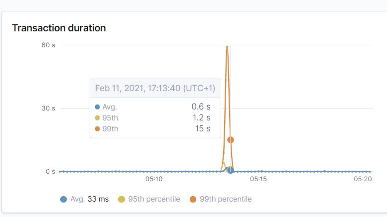
Many monitoring setups surface percentile data by default. For instance, here's Elastic APM:

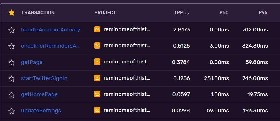
Sentry:

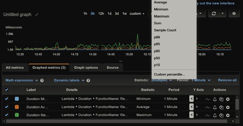
AWS Lambda metrics show average, minimum and maximum response time by default, but you can select a percentile:

So that's the long and short of it. It's a game of numbers. We want our services to be fast, but because computers are weird, software is evil and resources are shared, we can't make every request equally fast. Some requests will inevitably be slower than others. So we do the next best thing: make most of them fast and minimize outliers. I think the mean works best for detecting a problem (if our mean response times rise from 200ms to 800ms, something's probably going on), while percentiles help us set targets and focus our engineering efforts on optimizing for the majority
Postscript: Here's a post from the Section blog that goes into a bit more detail on long-tail latency. I like this quote: "humans do not perceive the commonplace; they do not forgive you because your average is good". Basically, users don't care about your average; they care about their experience. (It's called a long tail because when you plot it on a graph, it literally looks like a tail.)
I write about my software engineering thoughts and experiments. Want to follow me? I don't have a newsletter; instead, I built Tentacle: tntcl.app/blog.shalvah.me.